
Just like you may refresh your wardrobe for summer, your marketing might need a refresh, too. Take a look at Skittles, for instance. Around for nearly 50 years, the beloved candy brand is getting a makeover, just in time for summer.
Summer Marketing Refresh With Skittles
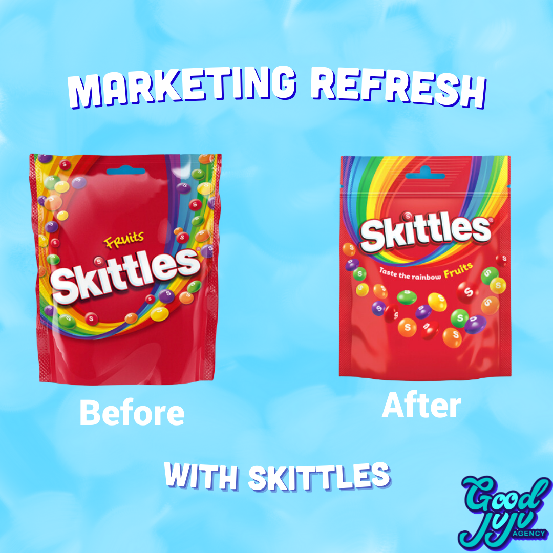

The brand says that its packaging is going to change in three major ways:
- The Typography
- The Rainbow
- The Candies
Previously the Skittles logo had the word “Fruits” located above the word “Skittles”. Now “Fruits” will follow “taste the rainbow” under the rainbow on the packaging. “Skittles” is also going from straight text to slightly curved. All of these changes enhance the view of the brand name, making it pop off the packaging. The placement of the candies and the rainbow are going to move as well. Before the candies were on top of the rainbow making both elements lost in one another. Now the candies are featured under the slogan, away from the rainbow. The colors in the rainbow are brightened, and now, all the elements on the bag pop.
In “Let[ting] the Rainbow Shine and the lentils (the candies) Fly” Skittles can freshen up, keeping their brand as iconic and marketable as it has for decades.